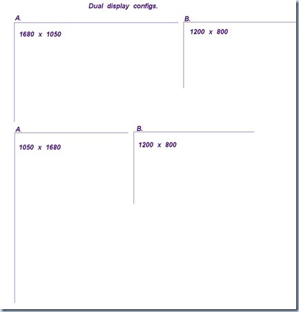
There's a lot of trapped white space (well, light blue space here) in my blog posts when viewed in a wide screen format. I don't care enough to fix it. I have a funny set up with my current home computing systems where I extend my desktop over two screens. One screen (the primary where I view webpages) is at 1050 x 1680 (a regular HD capable screen rotated 90 degrees so that it's tall, and not long). The other screen is wide screen in the regular horizontally aligned rectangle (1200 x 800). This second screen is where I type up my blog entries. Here is an image to show you the 'logical' way to set up two wide screen screens . . . and the bottom two screens depict how I've set my system up.
Why is this important you ask? Well, because it explains why my blog looks funny in wide screen (got me there, SLC Dunk!). Why do I have my screens set up like this? I happen to have to read a lot of pdf files (that are things like scanned journal pages or whatever), or view things roughly x-ray shaped, or read blogs a lot. It's just easier to read something aligned like a page (11" by 8.5") than to have to keep scrolling endlessly.
My Blog looks fine on my set-up, at the expense of looking strange on other computers. Whatever . . .


0 comments:
Post a Comment